Luna

Juno
We were told to remake the opening scene of Juno so we got the idea of filming and editing in preparation for the real thing. I worked with Dom Freedman and Ellie Robson. We watched the clip of the opening of the film to match the camera shots.
I liked the transition of the camera moving from the telephone pole to ellie who was "Juno". I liked most of the shots we did and I think it matched the Juno opening very well.
I did not like the fact that we had to keep reshooting the scene where she is walking towards the tree as we tried to use a trolley to pull the camera along so the shot was smooth, but it just made it bumpier.
Peer evaluation of Preliminary task
People thought my preliminary task was very good because:
- Of the gag reel we added at the end of the sequence
-The title sequence was very effective and fit well with the given genre
-commercial comedy made sense to the audience
-Camera angles added variety
-Titles were professional
-The transitions between shots
-Good costumes and acting
- Sound effects were used well
What aspects could have been improved;
-Some parts were too long
-Some close ups were fuzzy and can be shot cleaner
-Continuity was an issue
-Change of setting
-Overlap in some shots
-Sound needs to be clearer
- Of the gag reel we added at the end of the sequence
-The title sequence was very effective and fit well with the given genre
-commercial comedy made sense to the audience
-Camera angles added variety
-Titles were professional
-The transitions between shots
-Good costumes and acting
- Sound effects were used well
What aspects could have been improved;
-Some parts were too long
-Some close ups were fuzzy and can be shot cleaner
-Continuity was an issue
-Change of setting
-Overlap in some shots
-Sound needs to be clearer
PrelimInary task - CANDYMAN
We worked well as a group, even though we had to do several shots of each scene. We didn't argue which was good and agreed on most things that we were going to put into the preliminary task.
Art of the title sequence
A title sequence is how films or television programs present their title, characters and cast, directors and producers. Depending on the genre of the film, if it's a comedy for example the title may be quite joyful, colourful and eye-catching.
The function of a title sequence is to get the audiences' attention and give out information to them, for example which actors/actresses are in the film, who directed it, the title of the film, etc.
Three of the films I chose out of A Brief History of the Art of the Title Sequence are Saturday Night Fever, Forrest Gump and The Pink Panther.
The typography in the Saturday Night Fever title sequence is in the form of luminous red tube lighting, the type of lighting that you'd see outside some nightclubs in the seventies. It has John Travolta's face before the title, who looks quite young, handsome but looks quite troublesome at the same time. He's wearing a leather jacket which is well-known fashion for men in the seventies which also gives an idea of the time period it is set in to any audience, his hairstyle is very seventies as well. In the sequence there is a camera shot of his feet whilst he is walking after a camera shot of his face. His shoes look smart, possibly dancing shoes. Dancing involves the feet, so for the title sequence to show a camera shot of feet gives the impression that there may be dancing involved in the film.
http://www.youtube.com/watch?v=okpCx87orOA
The Pink Panther opening sequence shows the cartoon character, which is the pink panther himself. The typography is very elegant looking, and pink. It is also surrounded by sparkles which makes it looks slightly classy even though its a cartoon. The title tells the audience exactly what the film will probably be about.
Brazil title sequence begins in the sky with a song playing of the same name as the film, the music is quite lively so you expect a funny, happy sort of film. The title of the film does not appear straight away, it says the time which is 8:49 pm and somewhere in the 20th century in simple mature writing, in black which may represent death. Then the camera focuses on an advert being displayed in a shop window on a tiny screen, by this you can tell it is in the late 20th Century. As the advert seems to draw to a close, the unexpected happens, as a man walks past dressed in winter clothes with Christmas presents wrapped in a shopping basket (you can now tell what time of year it is) the shop explodes. Then the music changes dramatically from being happy to serious, fast and furious and scary. The title is luminous red and blue tube lighting which looks like it belongs to a hotel either called Brazil, or in the country Brazil or both. Then after the camera zooms into the title, it shows the remains of the exploding, where there are leftover flames and TV's scattered everywhere, but there is one working TV, which shows news about terrorist bombings. Overall, Richard Morrison builds up an atmosphere and energy that you do not expect to happen once it has climaxed, watching the beginning you think it is a happy film because of the music but in the end you are surprised to find out what the film really is about.
The dreamers title sequence is my second chosen opening. The music is quite fast and shows a lot of blue, red and white scaffolding which are the colours of the French flag, the scaffolding could be a close up of the Eiffel tower. When the title appears "the dreamers" the "A" stands out more than the other words and is stretched out to look like the Eiffel tower, by this point you would have to be an idiot not to guess that this film is based in France.
The function of a title sequence is to get the audiences' attention and give out information to them, for example which actors/actresses are in the film, who directed it, the title of the film, etc.
Three of the films I chose out of A Brief History of the Art of the Title Sequence are Saturday Night Fever, Forrest Gump and The Pink Panther.
The typography in the Saturday Night Fever title sequence is in the form of luminous red tube lighting, the type of lighting that you'd see outside some nightclubs in the seventies. It has John Travolta's face before the title, who looks quite young, handsome but looks quite troublesome at the same time. He's wearing a leather jacket which is well-known fashion for men in the seventies which also gives an idea of the time period it is set in to any audience, his hairstyle is very seventies as well. In the sequence there is a camera shot of his feet whilst he is walking after a camera shot of his face. His shoes look smart, possibly dancing shoes. Dancing involves the feet, so for the title sequence to show a camera shot of feet gives the impression that there may be dancing involved in the film.
http://www.youtube.com/watch?v=okpCx87orOA
The Pink Panther opening sequence shows the cartoon character, which is the pink panther himself. The typography is very elegant looking, and pink. It is also surrounded by sparkles which makes it looks slightly classy even though its a cartoon. The title tells the audience exactly what the film will probably be about.
Brazil title sequence begins in the sky with a song playing of the same name as the film, the music is quite lively so you expect a funny, happy sort of film. The title of the film does not appear straight away, it says the time which is 8:49 pm and somewhere in the 20th century in simple mature writing, in black which may represent death. Then the camera focuses on an advert being displayed in a shop window on a tiny screen, by this you can tell it is in the late 20th Century. As the advert seems to draw to a close, the unexpected happens, as a man walks past dressed in winter clothes with Christmas presents wrapped in a shopping basket (you can now tell what time of year it is) the shop explodes. Then the music changes dramatically from being happy to serious, fast and furious and scary. The title is luminous red and blue tube lighting which looks like it belongs to a hotel either called Brazil, or in the country Brazil or both. Then after the camera zooms into the title, it shows the remains of the exploding, where there are leftover flames and TV's scattered everywhere, but there is one working TV, which shows news about terrorist bombings. Overall, Richard Morrison builds up an atmosphere and energy that you do not expect to happen once it has climaxed, watching the beginning you think it is a happy film because of the music but in the end you are surprised to find out what the film really is about.
The dreamers title sequence is my second chosen opening. The music is quite fast and shows a lot of blue, red and white scaffolding which are the colours of the French flag, the scaffolding could be a close up of the Eiffel tower. When the title appears "the dreamers" the "A" stands out more than the other words and is stretched out to look like the Eiffel tower, by this point you would have to be an idiot not to guess that this film is based in France.
Shots in films

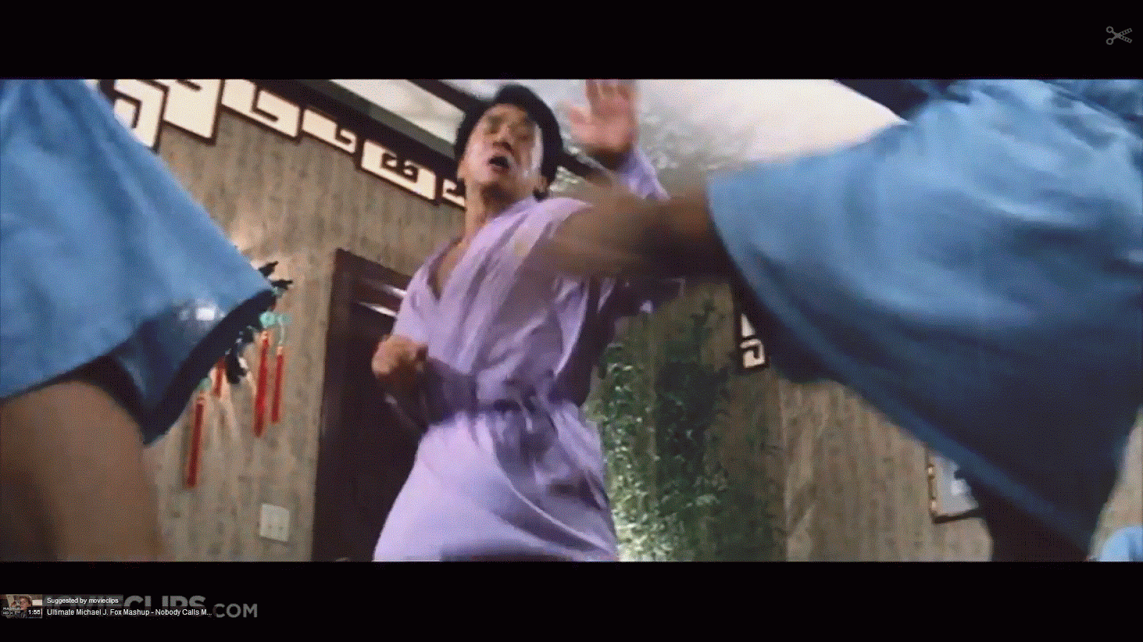
Over the shoulder shot in Rush hour 2
This shot focuses on these two characters more as they have a conversation. It is done over Chris tucker's left shoulder and would have been continued over Jackie Chan's right shoulder.
Low shot
This shot with the camera at a low angle makes Jackie Chan seem quite powerful as he fights off two enemies.

CLOSE UP
Puts more focus on Chris Tucker as he is talking, what he might be saying is either really funny or important.

TWO SHOT MIDSHOT
Here Chris Tucker is sitting up and the other guy is sitting down as they are having a conversation. Here this might be a respect and power thing as Chris Tucker here looks more of a respected and powerful character than the other guy is. This is not as closely focused as other conversations between characters may be but this would usually be used when one character is standing and the other is sitting.

This character is being looked down on by the camera being at a high angle. This makes the character seem small and insignificant, and possibly less powerful.
3 favourite preliminary tasks
1. Celestial
I really liked this horror preliminary task because there wasn't a single fault with it. It had good conventions and it definitely made me jump at the end and we could tell which genre it belonged to. The opening was very creepy and the music went well with it. The continuity was brilliant and even though there wasn't much script it was really effective because horror films are all about creepy sound effects, make up and movement which are all the key things that this prelim task contained.
2. Found
I liked the camera shots, especially where he's walking down the pathway and the camera is positioned slightly above his height. The writing in the beginning of the film along with the sound of a police siren was quite good. The tracking and continuity is really good and the song choice in the beginning was very emotional. I especially liked the part where he dropped the phone as the continuity was spot on, it is very difficult to master this as I have found.
3. Time out
You can tell which genre this task belongs to as it is rather obvious as the characters are singing. The miming overall to the songs were quite good and so were the camera shots. The continuity and sound effects were great. Even though it was quite short it covered the brief and was quite enjoyable to watch.
I really liked this horror preliminary task because there wasn't a single fault with it. It had good conventions and it definitely made me jump at the end and we could tell which genre it belonged to. The opening was very creepy and the music went well with it. The continuity was brilliant and even though there wasn't much script it was really effective because horror films are all about creepy sound effects, make up and movement which are all the key things that this prelim task contained.
2. Found
I liked the camera shots, especially where he's walking down the pathway and the camera is positioned slightly above his height. The writing in the beginning of the film along with the sound of a police siren was quite good. The tracking and continuity is really good and the song choice in the beginning was very emotional. I especially liked the part where he dropped the phone as the continuity was spot on, it is very difficult to master this as I have found.
3. Time out
You can tell which genre this task belongs to as it is rather obvious as the characters are singing. The miming overall to the songs were quite good and so were the camera shots. The continuity and sound effects were great. Even though it was quite short it covered the brief and was quite enjoyable to watch.
Evaluation of pitch presentation
I presented my pitch to my class who evaluated it.
Most of the class said that my film title was relevant but doesn't particularly relate to zombies which might be a good thing as it would surprise the audience.
Majority thought the characters and cast were very interesting and appropriate for the age rating of my film as there is a very famous porn star, Lisa Ann, included which would attract many people of that age group and above.
There was interest created for the audience and the whole plot and characters were very well thought out.
My film has been said to absolutely target the audience and it will attract customers if it doesn't confuse them. The film includes sex, drugs, violence and alcohol which is appropriate for the target audience; the plot as a whole will attract the audience.
The narrative does fit in with the age bracket and genre. All the conventions are in place however, I may lose audience if its too convoluted. Its set in Las Vegas which is a place where a lot of comedies are set in.
Most of the class thought the film was very different as it is a comedy that involves zombies and death and has a varied cast. However, some thought it was quite similar to Shaun of the dead which is a British film.
Some people thought I had good ideas for the marketing of the film. I planned to advertise it on Youtube, billboards, magazines, etc only one person thought that there was not much marketing.
Overall, the whole class agreed that they would buy the rights to my film.
Logo

I chose to create this logo because it exudes power, like most entertainment company logos do but even more so. This logo will be quite competitive amongst other entertainment companies. It is inspired by Paramount Pictures due to its colour scheme and as the mountain is naturally formed, it is quite powerful in the eyes of nature. Also the forbidden fruit tree was naturally formed and is quite tall, like the mountain in Paramount Pictures logo.
Mise en Scene

The setting in Bridesmaids is a white background to emphasize the characters who are bridesmaids and the bride herself. The wedding dress and the bridesmaids dresses are the main props as they will play a major part in the film. The camera shot is a long shot to show all the characters' body language and posture. The bride (Maya Rudolph) is positioned in between Kristen Wiig and Rose Byrne which suggests that the two brides maids are both friends with the bride but are rivals to each other.
The other three bridesmaids to the right of the bride seem to be friends with each other because they have their arms round each other. They are on Kristen Wiig's side yet Kristen Wiig's character, Annie looks like she would rather be alone and may end up alone due to the fact that she's not putting her arms around anyone and her facial expression suggests she's rather bitchy and up herself. She's also standing the furthest forward showing that she is the main character in the film. Her posture is also rather slouched which may indicate she also can't be bothered with herself.
To the right of Kristen Wiig there's Ellie Kemper who plays Becca, her posture looks quite perfect and upright and her facial expression is quite neutral, may mean she's quite innocent. To her right is Wendy McLendon-Covey who's character is Rita, her pose suggests she's quite a raunchy, flamboyant sex-deprived character in the film, she's bending slightly so you can see her cleavage and she's pouting, trying to make herself deliberately more attractive to males. Also, to her right is Melissa McCarthy who plays Megan. Her posture indicates she's a strong character and a trustworthy friend, however, her facial expression looks tough as though despite the fact she'd be a good friend, at the same time you would not want to mess with her.
Maya Rudolph who plays Lillian, the bride, looks torn between Kristen Wiig's character (Annie) and Rose Byrne's character (Helen). She's allowing Helen to lean on her shoulder but the position of her head is turned to her right towards Annie which shows that she might not be sure on whether to trust Helen or not. Lastly, Helen who is separate from the other bridesmaids looks slightly outnumbered, and she's really leaning on the bride, as though she's trying to show she's the better friend to the bride out of her and Annie. However, she also looks really clingy and desperate to keep Lillian as her friend. There's a certain element about her body positioning that suggests she's quite controlling and influential towards Lillian.
Representation in a film opening sequence
This trailer shows what class/categories races are put into in society. The three black men look like the only black men in the store. The white man that works there keeps a very close watch of the three characters to see if they might steal anything or do any other action that is stereotyped towards black people. The white man that works there looks well off in an expensive looking suit and is employed whereas the three black men look unemployed even though they may not be and are wearing suits that do not look as nice or as expensive as the white man's. The white shop assistant unfairly treats the black men, and stereotypically acts like a stuck up and rich middle aged white man who thinks the black men will steal from the shop, and tells them that they do not do refunds, indicating the black men are dirty and poor by mentioning the price, as though he doesn't believe any of them would be able to afford the coat and they would not want the coat back from them if they were to return it. The black men have more of a personality than the white man and are loud and more centre of attention. They are into women and are happily to talk explicitly about the details of their relationships in public. One of the men talks about a woman and his friend represents her as a woman that is only after sex, when the other man thinks she's better than the sex, not a woman is in sight in this clip. This video clip fits in with Richard Dyer's representation of stereotypes very well.
I have received the meaning of this film through preferred reading (Halls theory) through the main character (played by Eddie Murphy) because you feel sorry for him and his friends that they are being racially discriminated against by a white shop assistant when they are barely doing any harm.
How the media portrays women.

How the Media portrays women?
Her boobs are out, there's another woman who has boobs out, there's a real life story on a man who blew money on prostitutes and alcohol which makes it look attractive to men because another man had done it. Women are seen as only good for sex. They look like objects not human beings. Probably photo shopped. If a man's girlfriend/wife was to come across this magazine she may feel degraded; this magazine makes women feel degraded already as they do not have a figure like that, even though the cover girl looks like she's had surgery. Refers to the woman's boobs as "airbags" which are objects. The colour of magazine is red meaning sex, passion danger if possible. The whole magazine has sex written all over it. Has slogans that tell you to do something such as, "Find out why she's hungry for ..." makes you think you need to find out. Includes sport to make it even more appealing to men. Could make men's views on women change, expect too much for the physical appearance of a woman.
Pictures associated with chick flick and action genres

Genre of this picture: Chick flick
Connotations: There's make up on the tissue suggesting it's something to do with a girl/girls. Most teenage girls like wearing make up. The bar of soap represents cleanliness, most teenage girls are conscious about personal hygiene and would probably use it to scrub off any unwanted make up and/or wash their hands. You may find these items in a bathroom setting which these were found in (edge of basin is in the picture). Majority of teenage girls do spend lengthy amounts of time in the bathroom mainly looking in the mirror to apply make up, do their hair etc.
Colours: The lipstick stain on the tissue is pink, pink is quite a girly colour. The tissue and the bar of soap are white which represents youth, possibly innocence depending on whether the girl is good or bad.

Genre of this picture: Action
Connotations: The car in the picture represents an action car racing film. The car is quite prominent in the photo, when you look at it it's in your face and looks quite intimidating. The building in the back makes it seem more action packed as most car racing films are set near a block of flats or near lots of tall buildings, not normally in the middle of the countryside.
Colours: The stripes on the car makes it look like a sports car, and the blue paint on the car suggests it is quite a masculine film.
GENRE: Zombie Comedy
Colours: Pale skin, dark dusty clothes
When he is imagining what the airport would be like if everyone was alive, the music changes and gets more livelier, people start talking in the background and the colours get brighter, as he comes back to reality of zombie life music and colour fades and gets dull.
Character: narrating throughout, lonely, lost, bored with being zombie, walks with hunched posture shows he's given up and not very confident
Forrest Gump Opening
SETTING: Outside, sitting on bench, on bus, sunny
THEMES: Love, friendship, trust
ICONS: Tree, leg braces
NARRATIVE: Forrest narrating in parts of the film, flicks back and forth between past and present
CHARACTERS: innocent man/boy bit on the simple side, insecure girl
TEXTURAL ANALYSIS: Quiet music in the background whilst he tells story, as he tells story camera's on character in beginning as an adult, when he met Jenny, films him when he was a little boy with Jenny as little girl, zooms in, summer themed, not much make up - only foundation to make face look light and flawless on camera
Subscribe to:
Posts (Atom)